Creative Concept Design • Flyer Design • Sticker Design
Problem
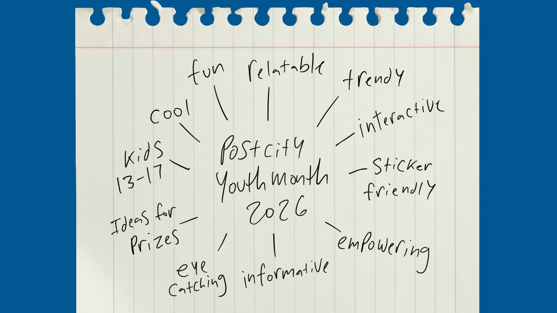
PostCity Credit Union wanted a Youth Month campaign that would connect with younger audiences (Ages 13-17 the ages that can have a youth account) in a way that felt authentic, energetic, and culturally relevant while promoting the value of youth savings accounts and financial independence.
PostCity Credit Union wanted a Youth Month campaign that would connect with younger audiences (Ages 13-17 the ages that can have a youth account) in a way that felt authentic, energetic, and culturally relevant while promoting the value of youth savings accounts and financial independence.
Solution
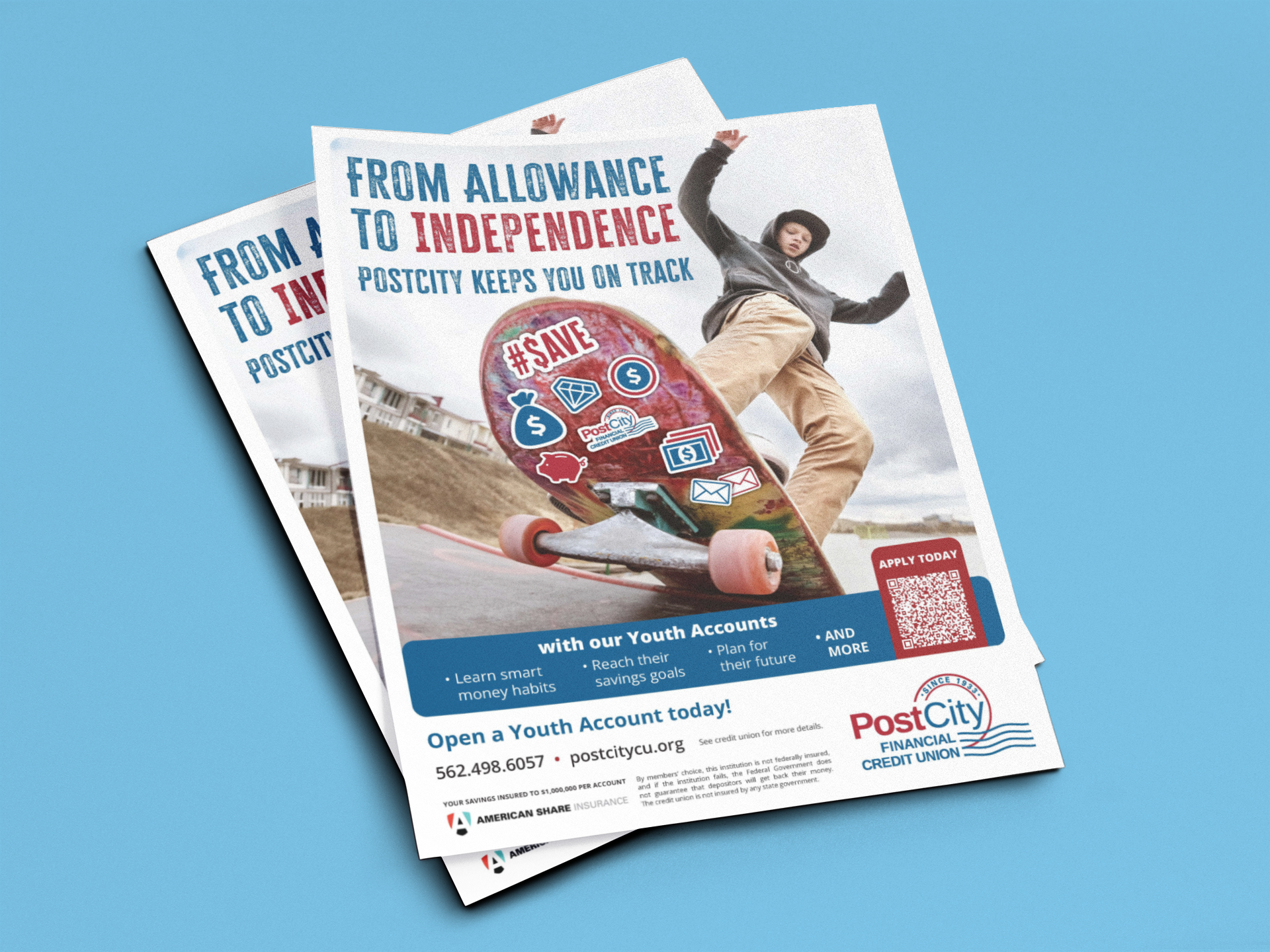
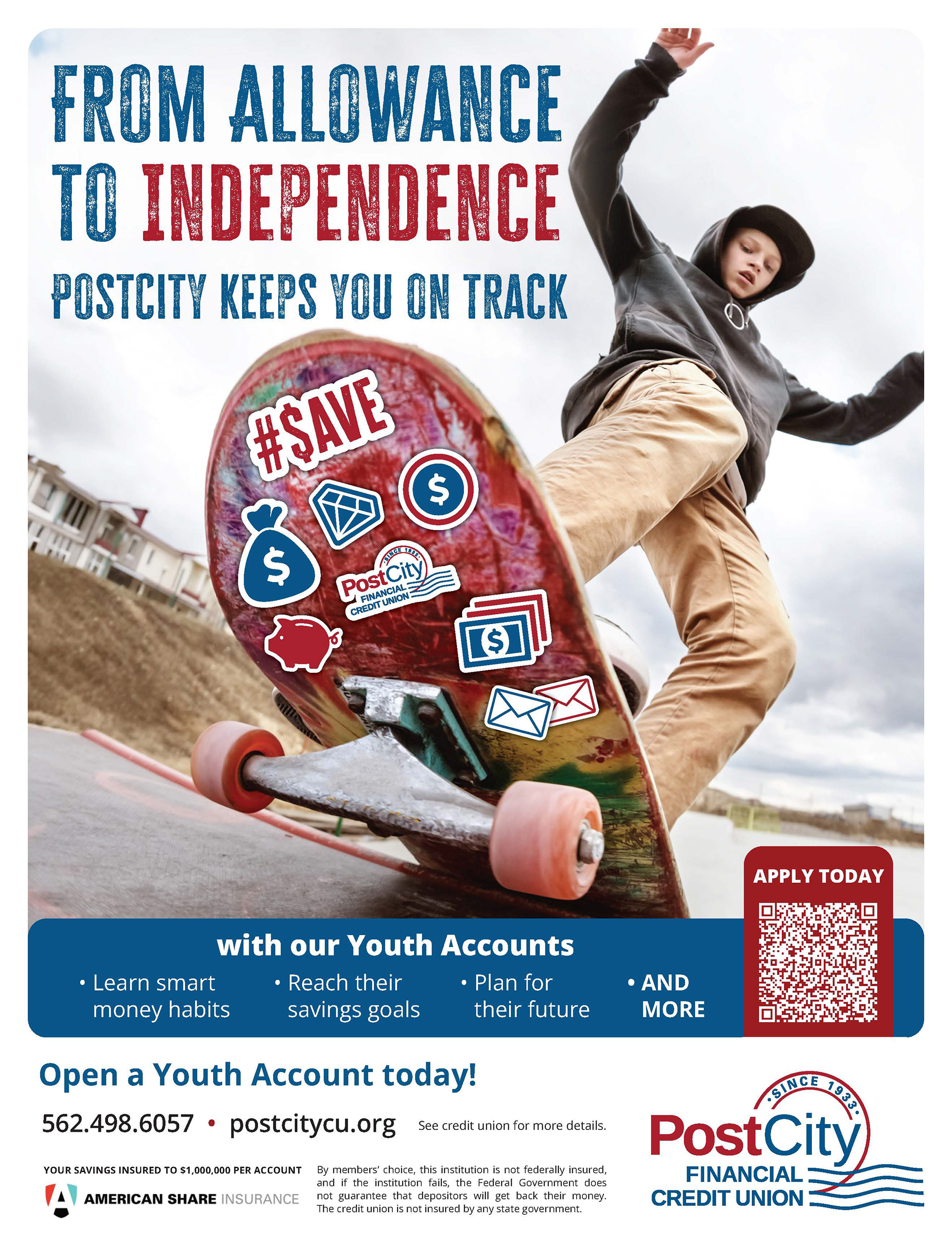
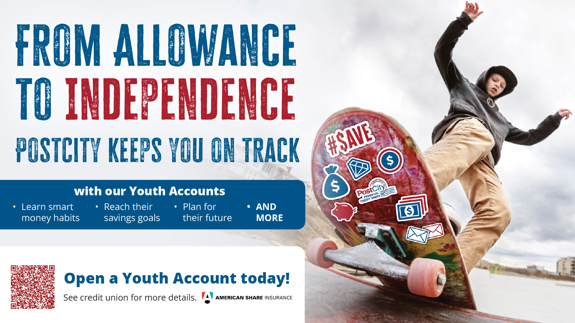
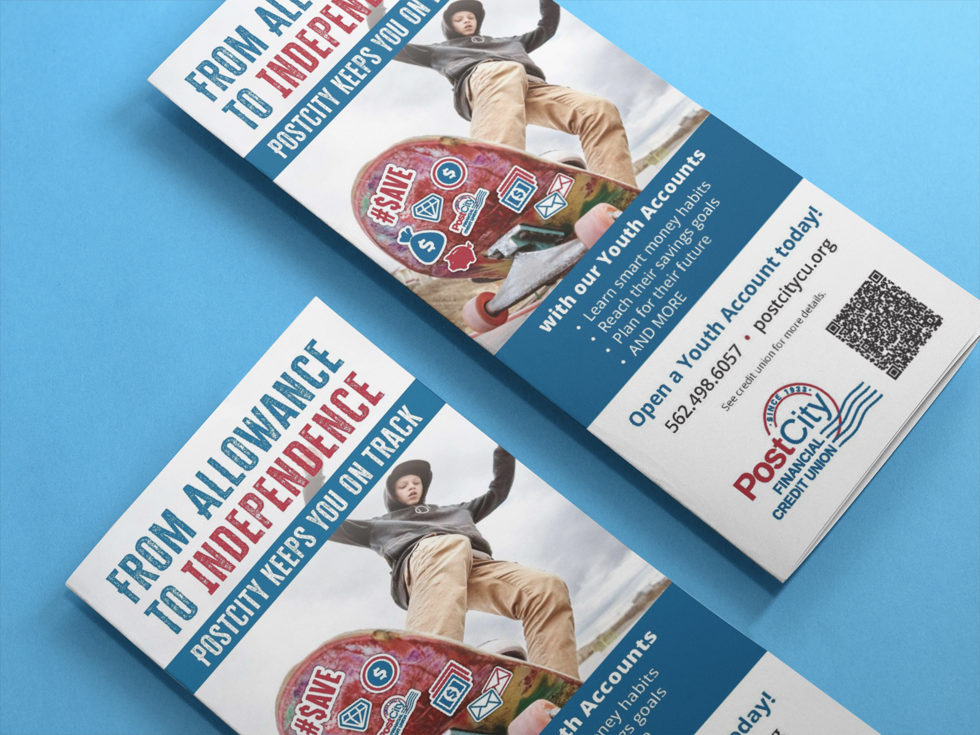
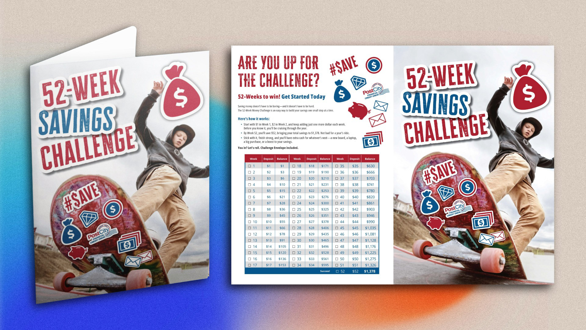
Inspired by Southern California skateboarding culture, I created a bold campaign centered around the idea of growing “from allowance to independence.” Using dynamic skate imagery, sticker-inspired graphics, and expressive typography, the campaign positioned saving money as something empowering, modern, and relatable for younger generations.
Inspired by Southern California skateboarding culture, I created a bold campaign centered around the idea of growing “from allowance to independence.” Using dynamic skate imagery, sticker-inspired graphics, and expressive typography, the campaign positioned saving money as something empowering, modern, and relatable for younger generations.
Process
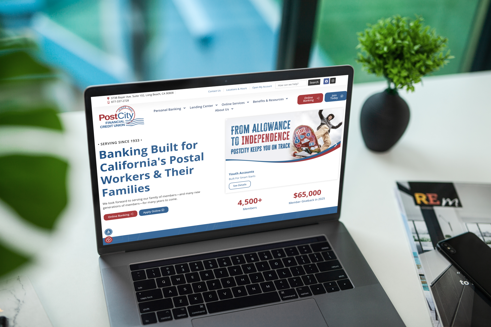
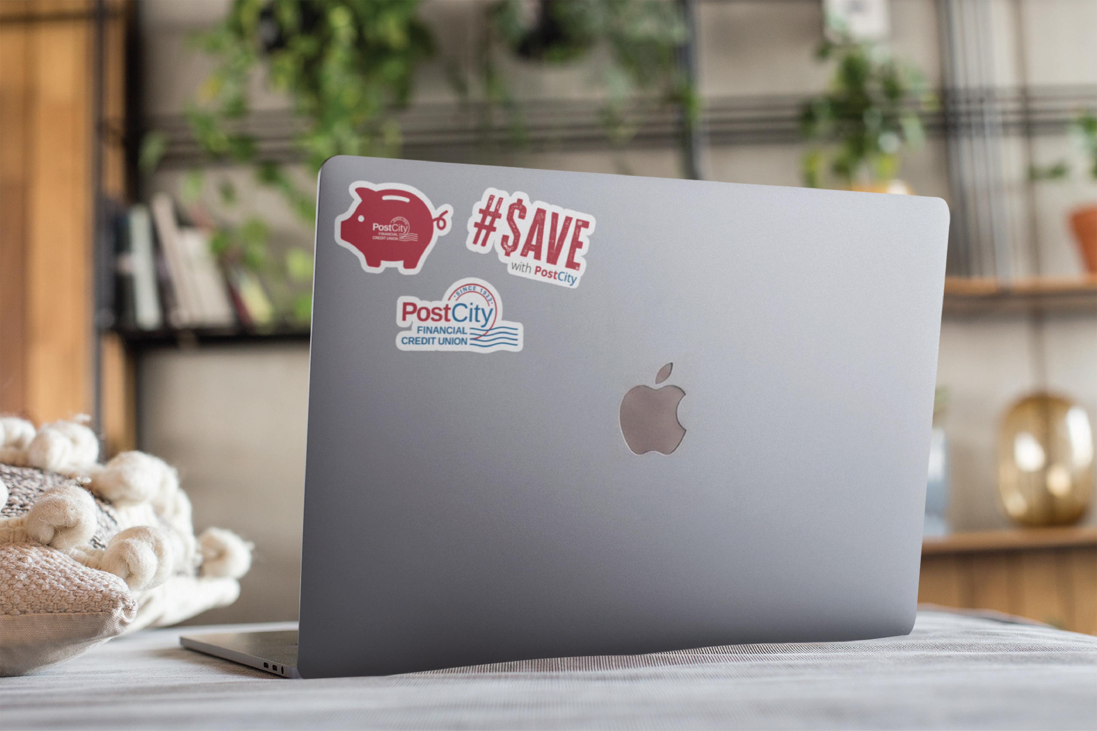
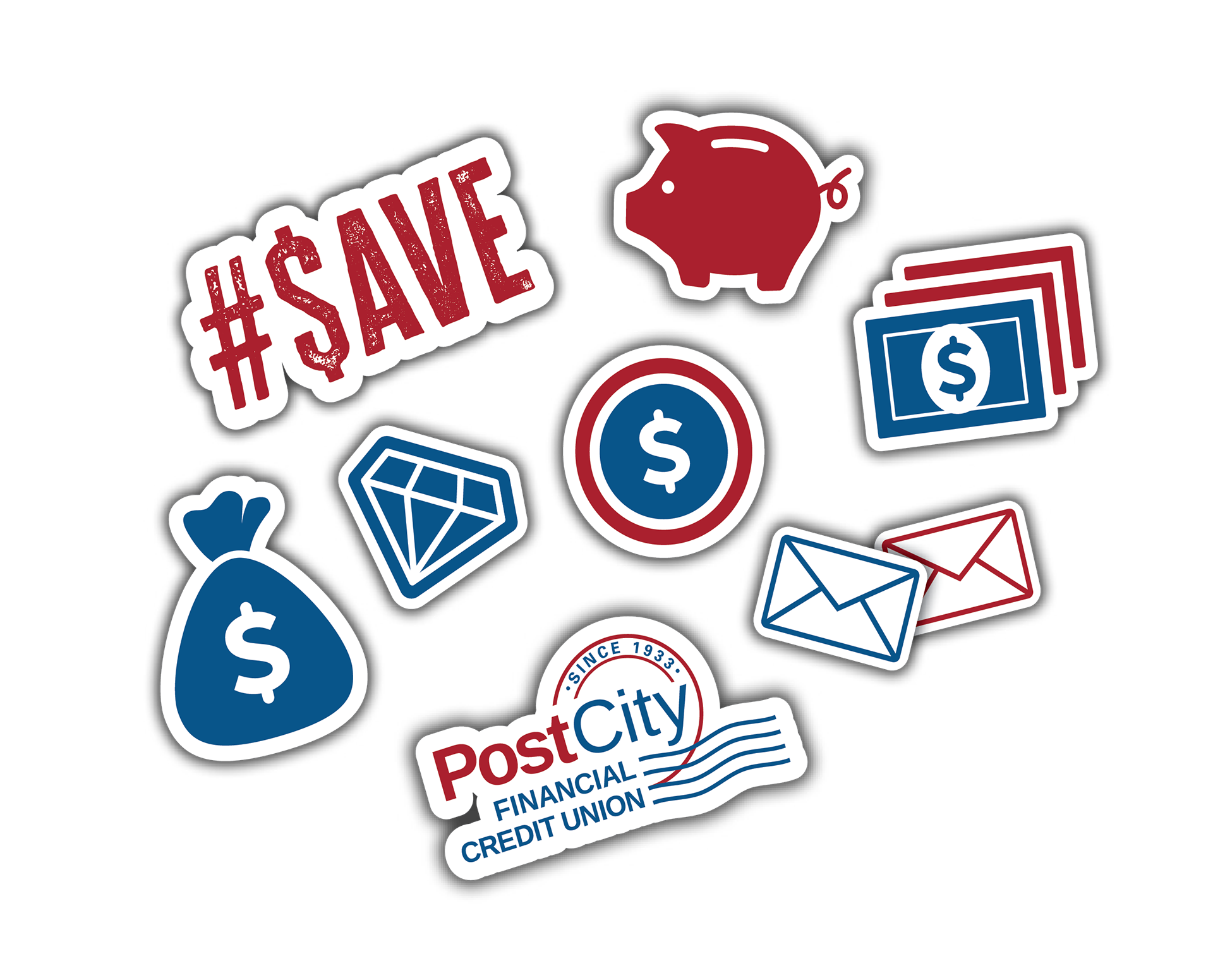
I developed the creative direction by blending lifestyle photography with playful financial icons placed like real skate stickers on a skateboard. The campaign messaging focused on building smart money habits, reaching savings goals, and planning for the future in an approachable way. I extended the visual system across print and digital touchpoints including flyers, web graphics, social media assets, and promotional materials to maintain consistency throughout the campaign.
I developed the creative direction by blending lifestyle photography with playful financial icons placed like real skate stickers on a skateboard. The campaign messaging focused on building smart money habits, reaching savings goals, and planning for the future in an approachable way. I extended the visual system across print and digital touchpoints including flyers, web graphics, social media assets, and promotional materials to maintain consistency throughout the campaign.
Why This Is Important
This campaign helped make financial education feel more accessible and engaging for young audiences by speaking their visual language instead of relying on traditional banking advertising. By tying financial growth to themes of freedom, fun, and self-expression, the campaign strengthened PostCity’s connection with younger members and their families.
This campaign helped make financial education feel more accessible and engaging for young audiences by speaking their visual language instead of relying on traditional banking advertising. By tying financial growth to themes of freedom, fun, and self-expression, the campaign strengthened PostCity’s connection with younger members and their families.
Software Used
Adobe Illustrator, Adobe Photoshop, Adobe InDesign
Adobe Illustrator, Adobe Photoshop, Adobe InDesign